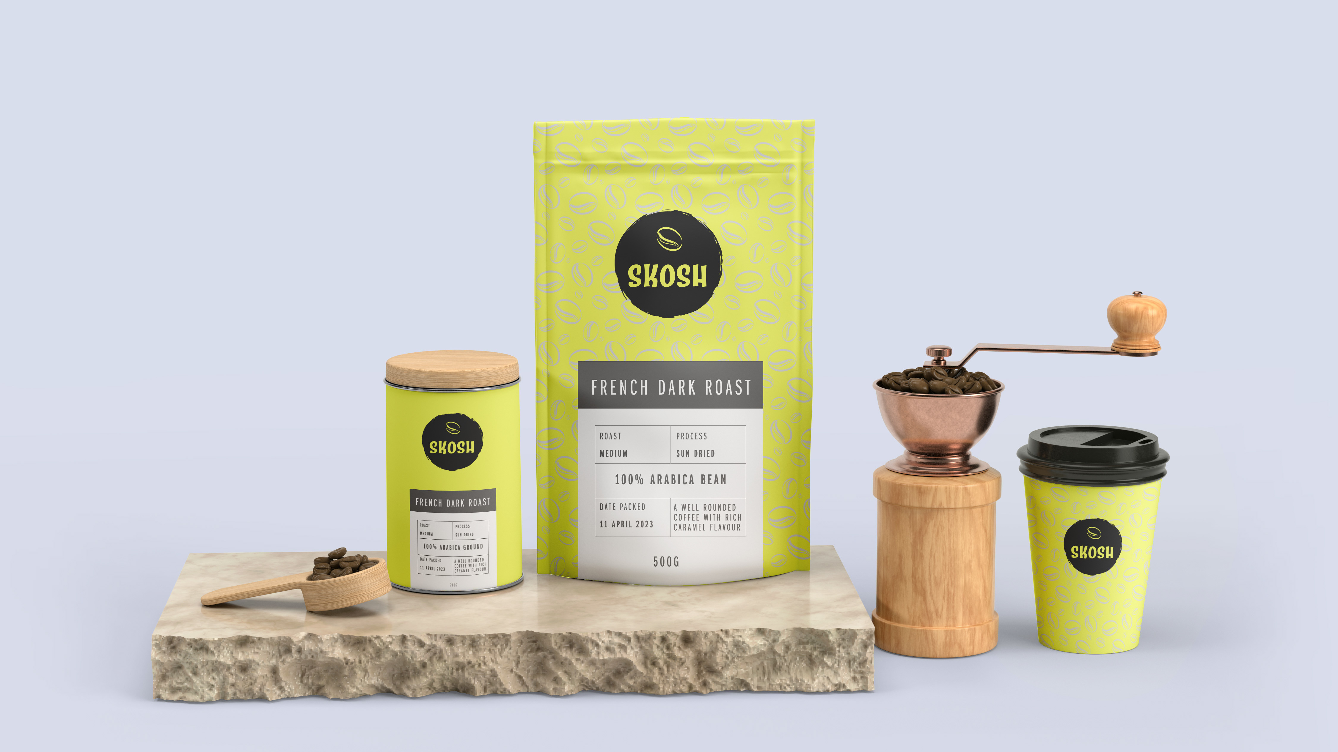
Designing the Merrigan Chocolate logo was a process deeply rooted in the brands history and the family’s identity.
Recognising the significance of the family-owned nature of the business, I shifted my focus to the name ‘Merrigan’ itself, as it held a pivotal role in the chocolate company. This insight led me to consider the owners’ personal connection to the brand, and how incorporating their signature could infuse a sense of personal touch and family value into the design.
Words alone couldn’t capture the desired essence, so I delved into the chocolate-making process itself, as the chocolate had its origins in the family’s kitchen.
My breakthrough came when I observed the actual chocolate-making process, where a spoon was used to spread and create intricate designs. This led to the decision to incorporate a chocolate swish, inspired by the motion of the spoon, elegantly encircling the owner’s signature.
The result was a unique, personalised logo that the family could unmistakably identify as their own, carrying the spirit of their chocolate-making traditions and family values.

This family-owned company takes immense pride in their cherished chocolate-making traditions that have been passed down through generations of chocolate makers.
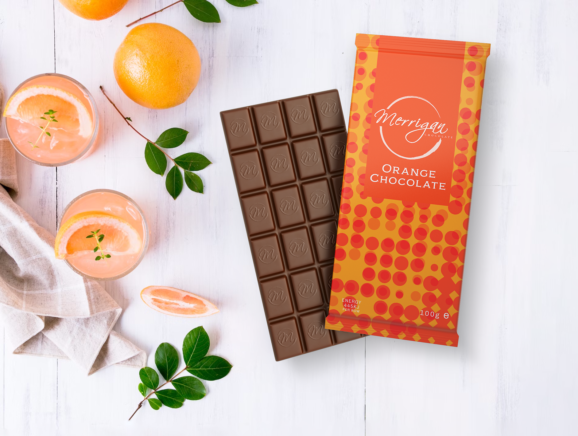
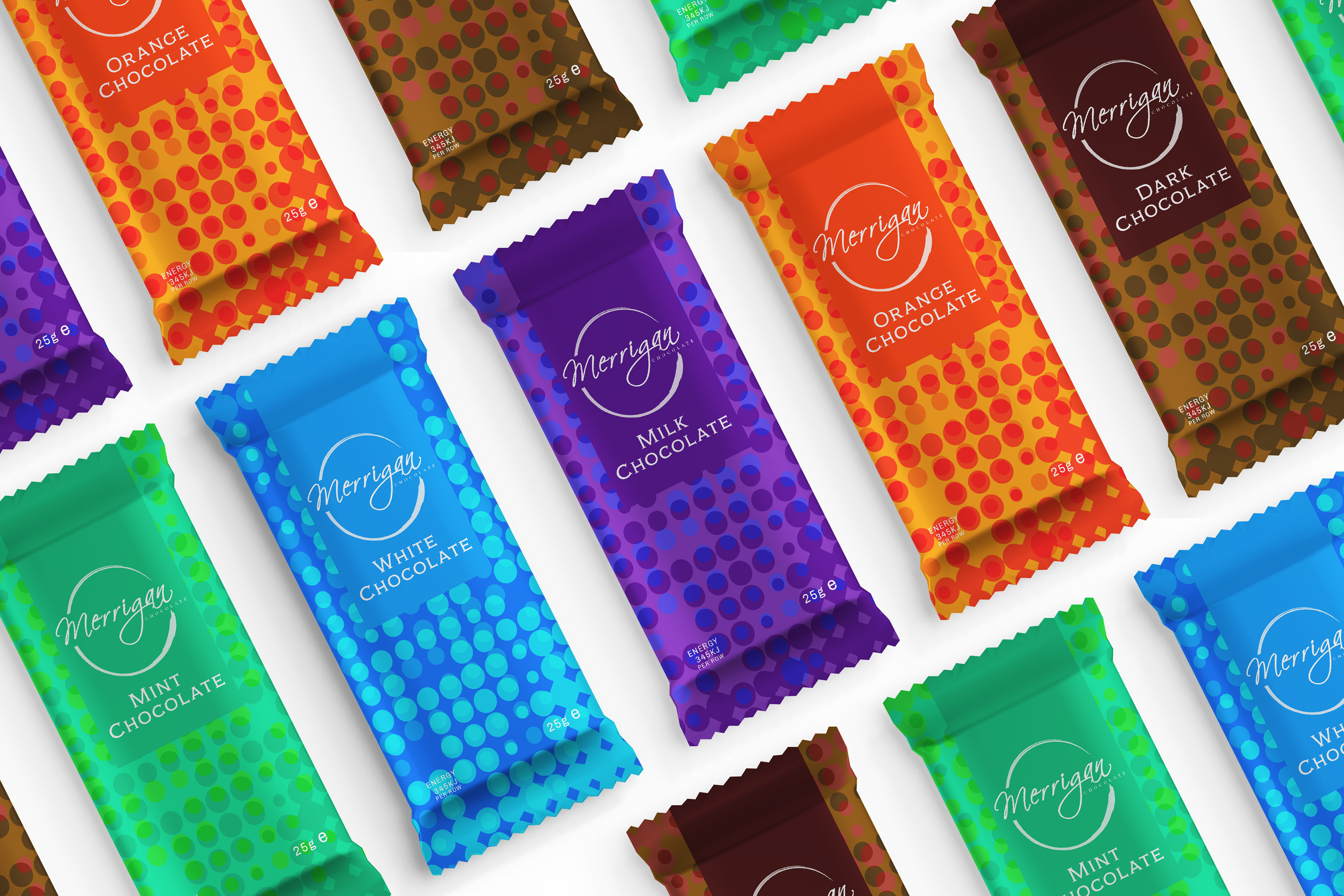
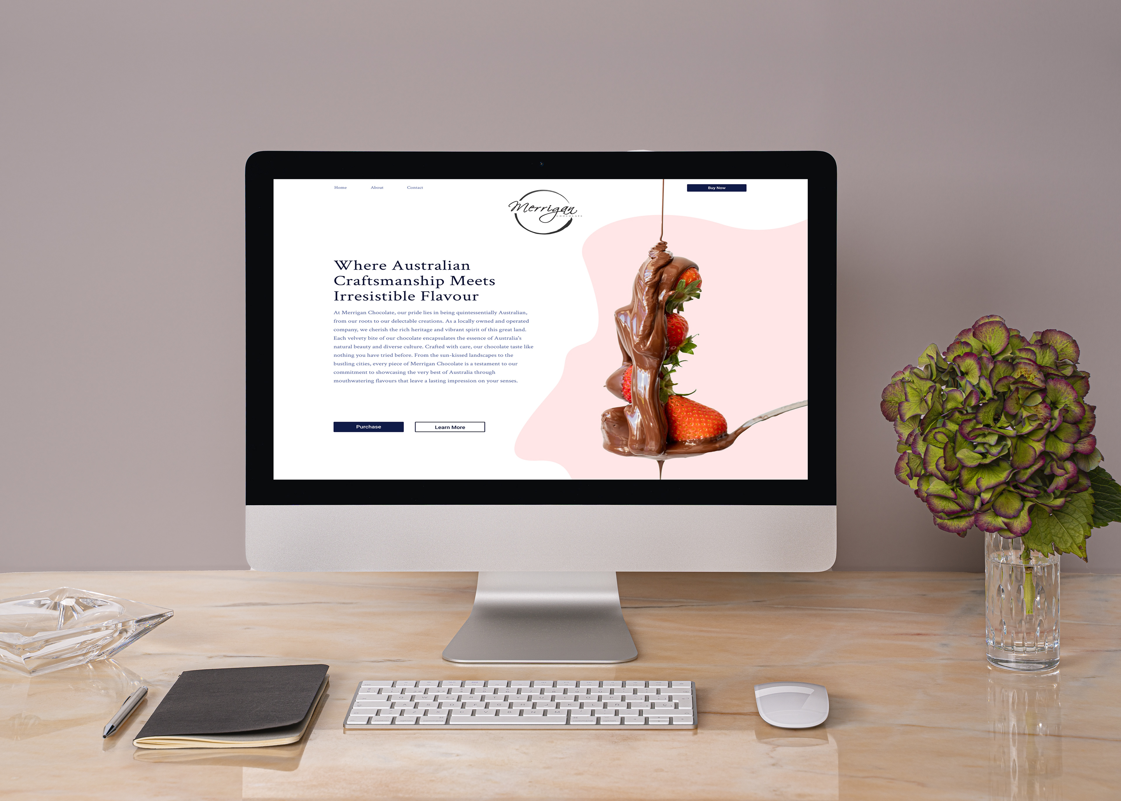
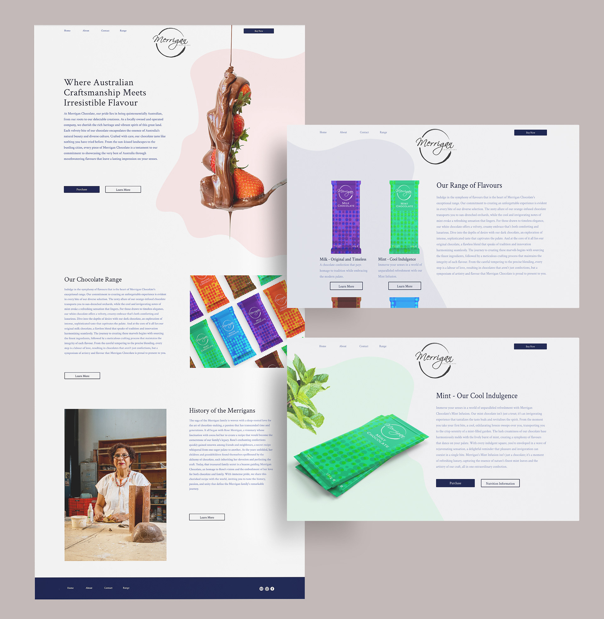
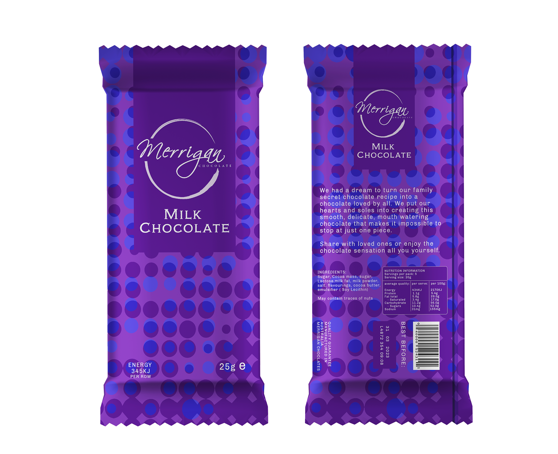
When I embarked on redesigning Merrigan Chocolate’s packaging, it was of utmost importance to preserve the essence of the family’s identity while infusing a touch of modernity and colour to rejuvenate this beloved, classic brand.
The selection of colours for the packaging was crafted to harmonise with the diverse flavours of the chocolates, creating a bright, inviting, and friendly palette that resonates with consumers. The variations in tones and hues within the simple design provide depth and character to the individual packaging,
The incorporation of a circular pattern serves as a tribute to the original chocolate drops that were the foundation of this legacy and adds a nice personal touch.