The name Gearz is derived from the word “gears,” which refers to the mechanical components that transmit power and motion.
In the context of sports items, the name suggests a product that is designed to enhance performance and provide the necessary support and traction for various athletic activities. The ‘Z’ at the end of the name adds a modern and trendy touch, which will appeal to a younger demographic.
I wanted this brand to have a strong presence with it’s competitors so experimented with different ways to replicate speed and strength.
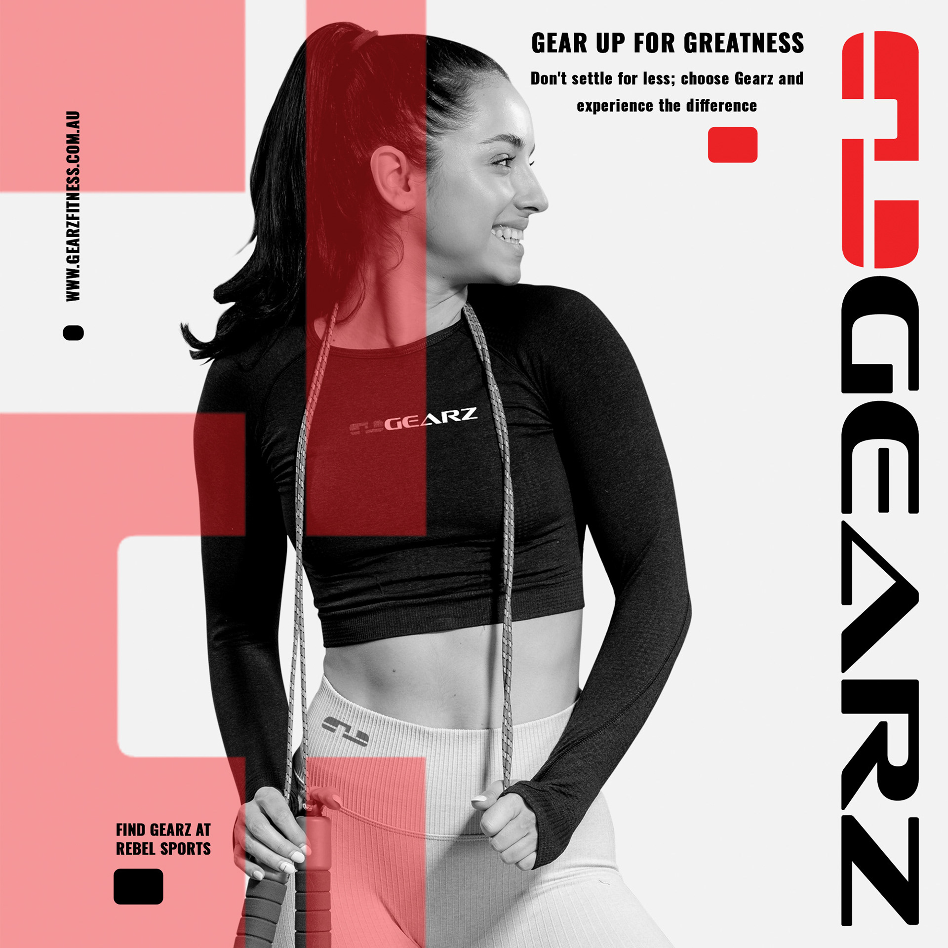
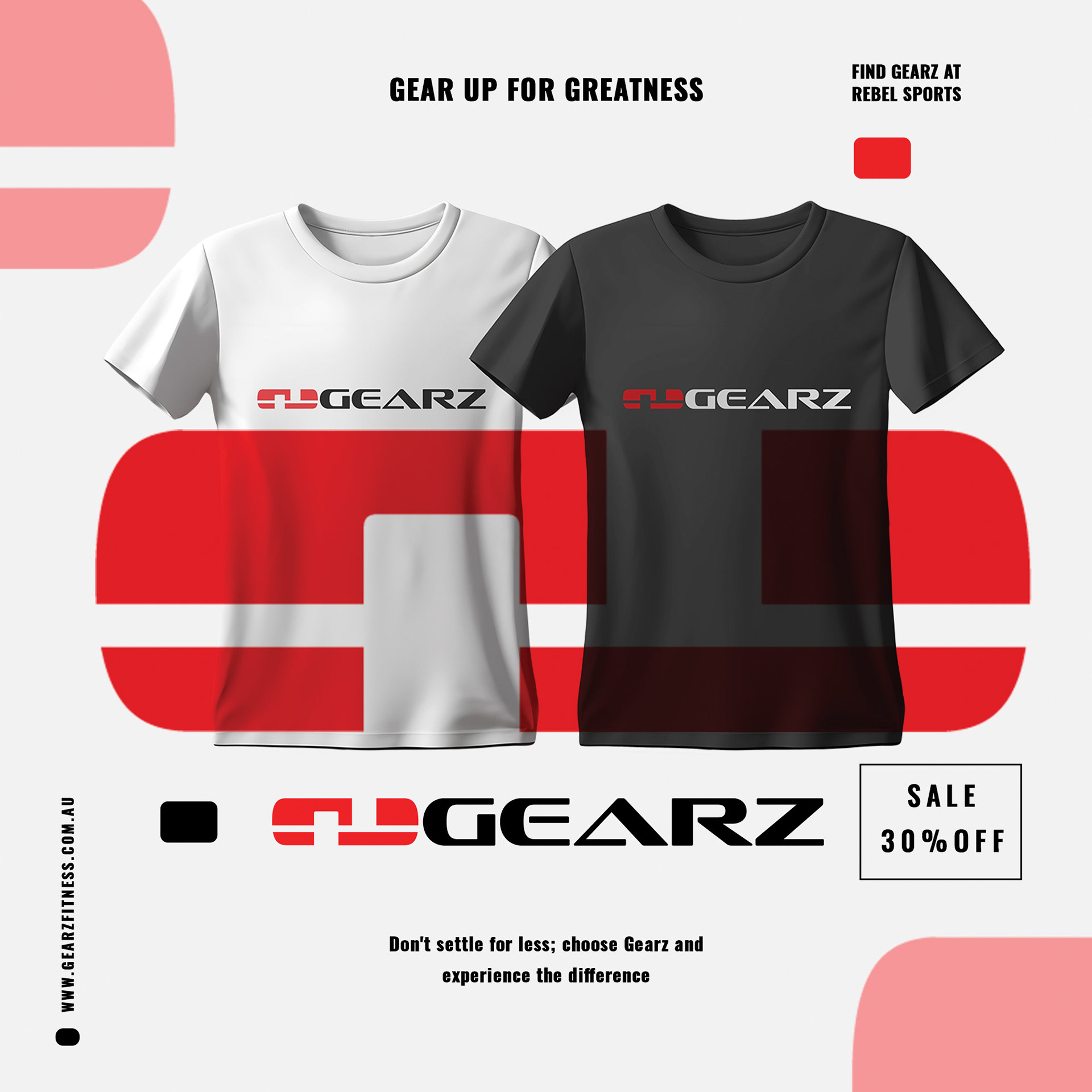
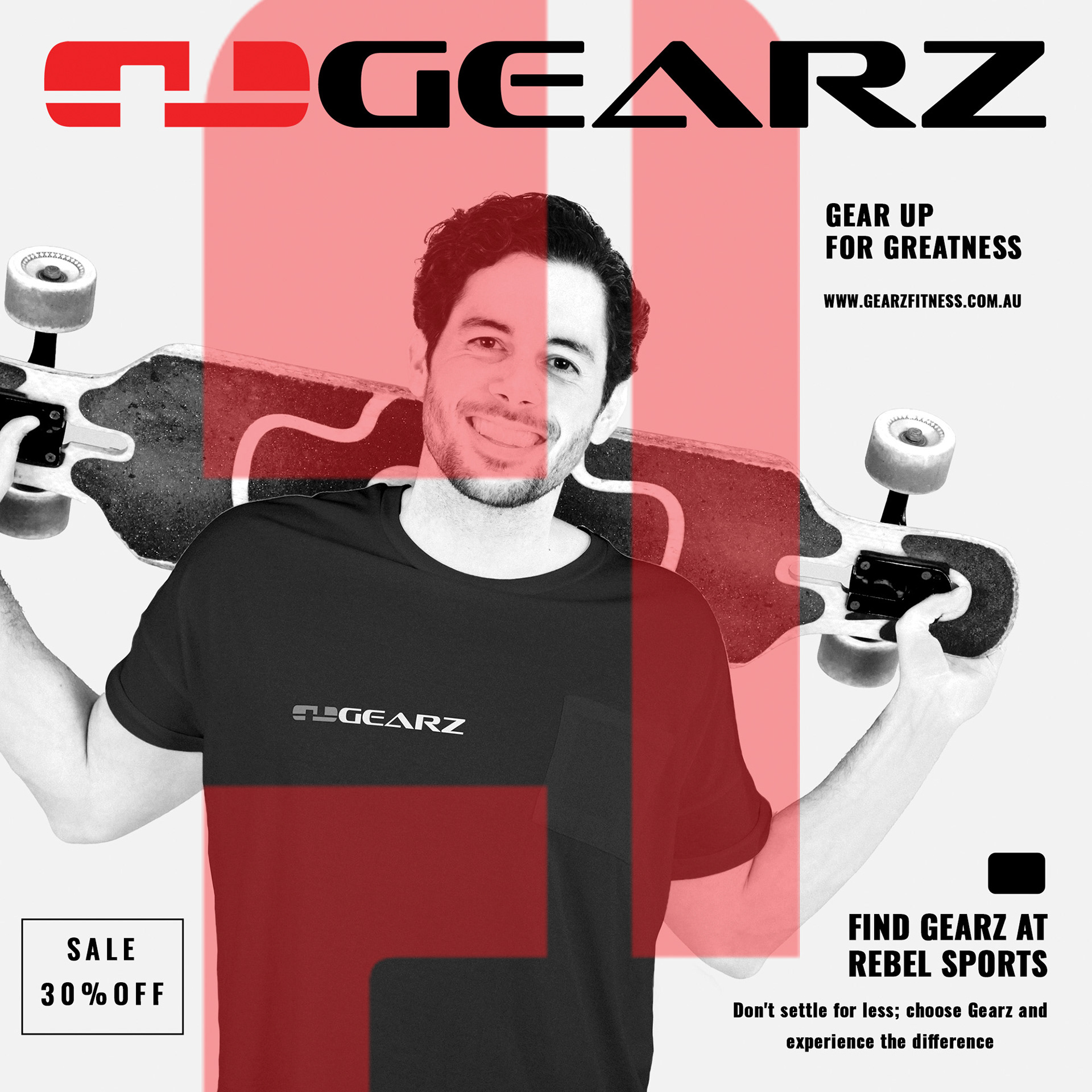
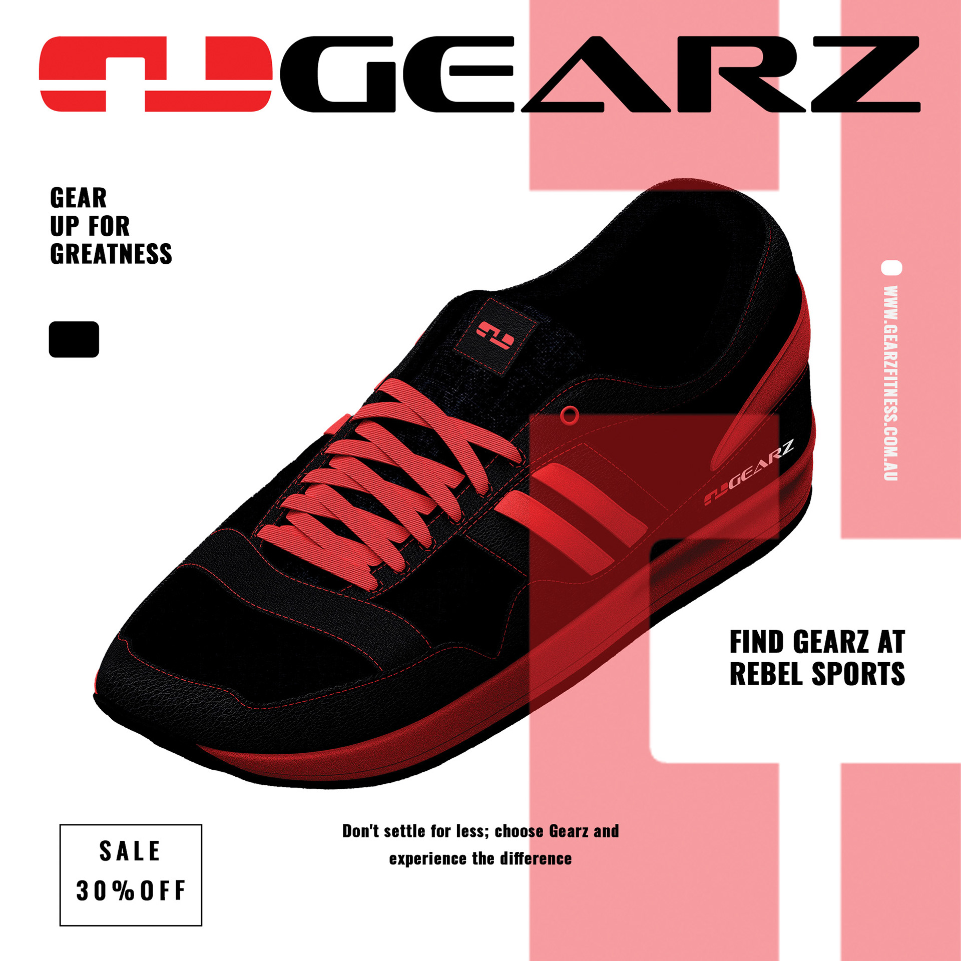
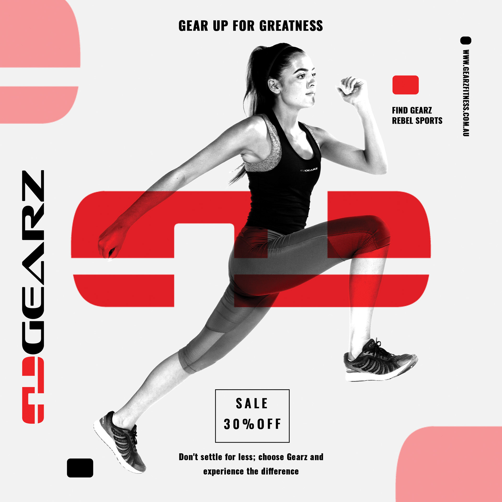
The chosen typeface exhibits a refined and precise design, characterised by robust curves and lines crafted to convey a palpable impression of swiftness and dominance. The logo, a fusion of the ‘G’ and ‘E’ shapes, leveraged negative space to construct a distinctive emblem that harmoniously integrates with the selected typeface, thus reinforcing a unified visual identity.
Overall, the name Gearz effectively conveys the idea of a high-quality, performance-oriented sports shoe.
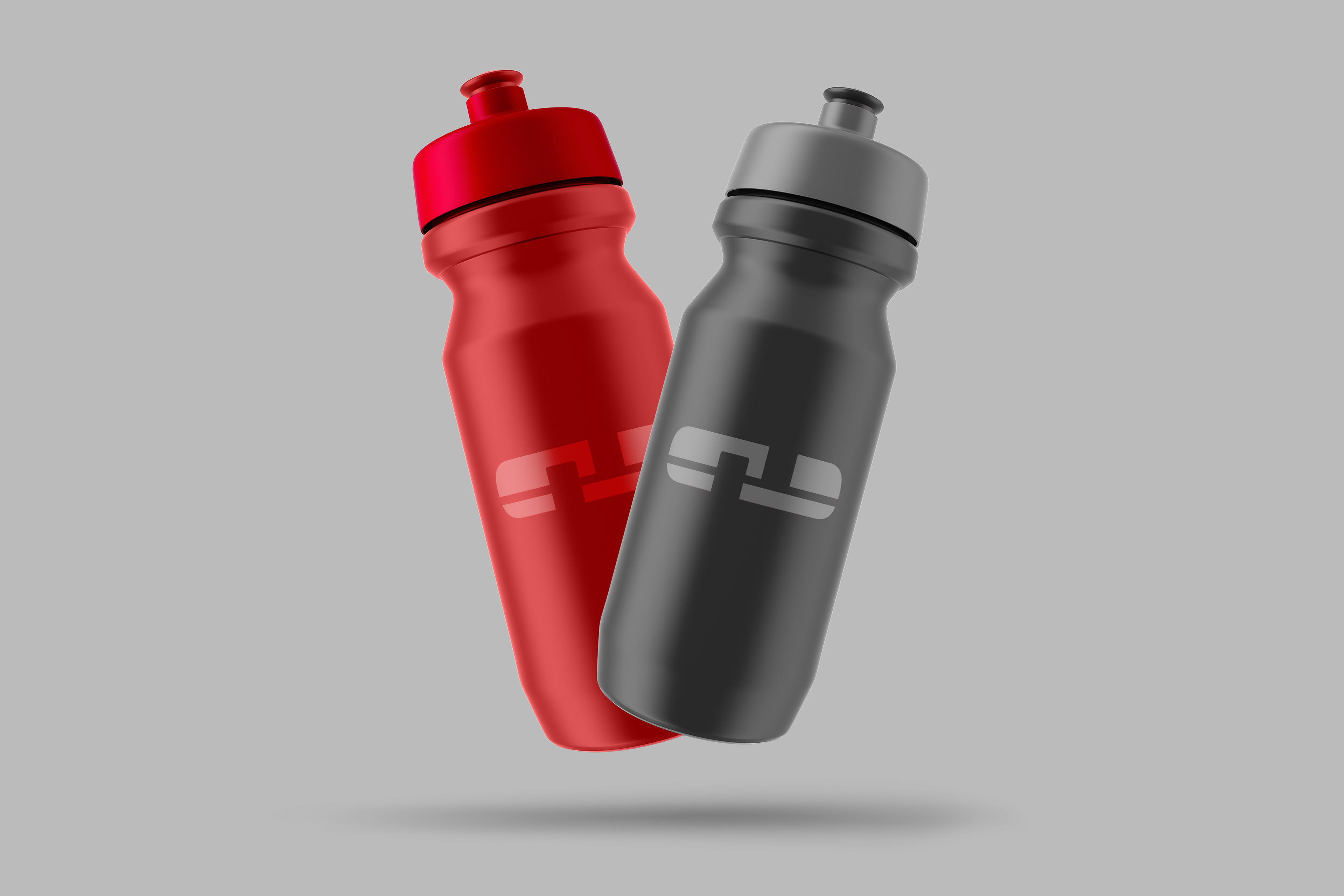
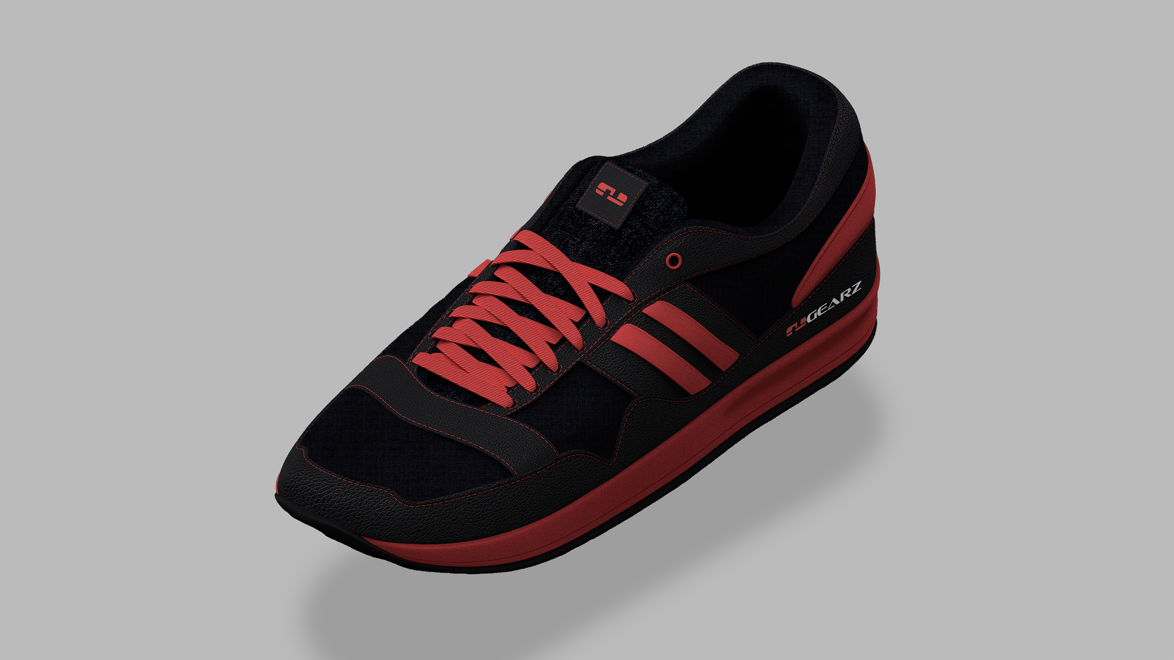
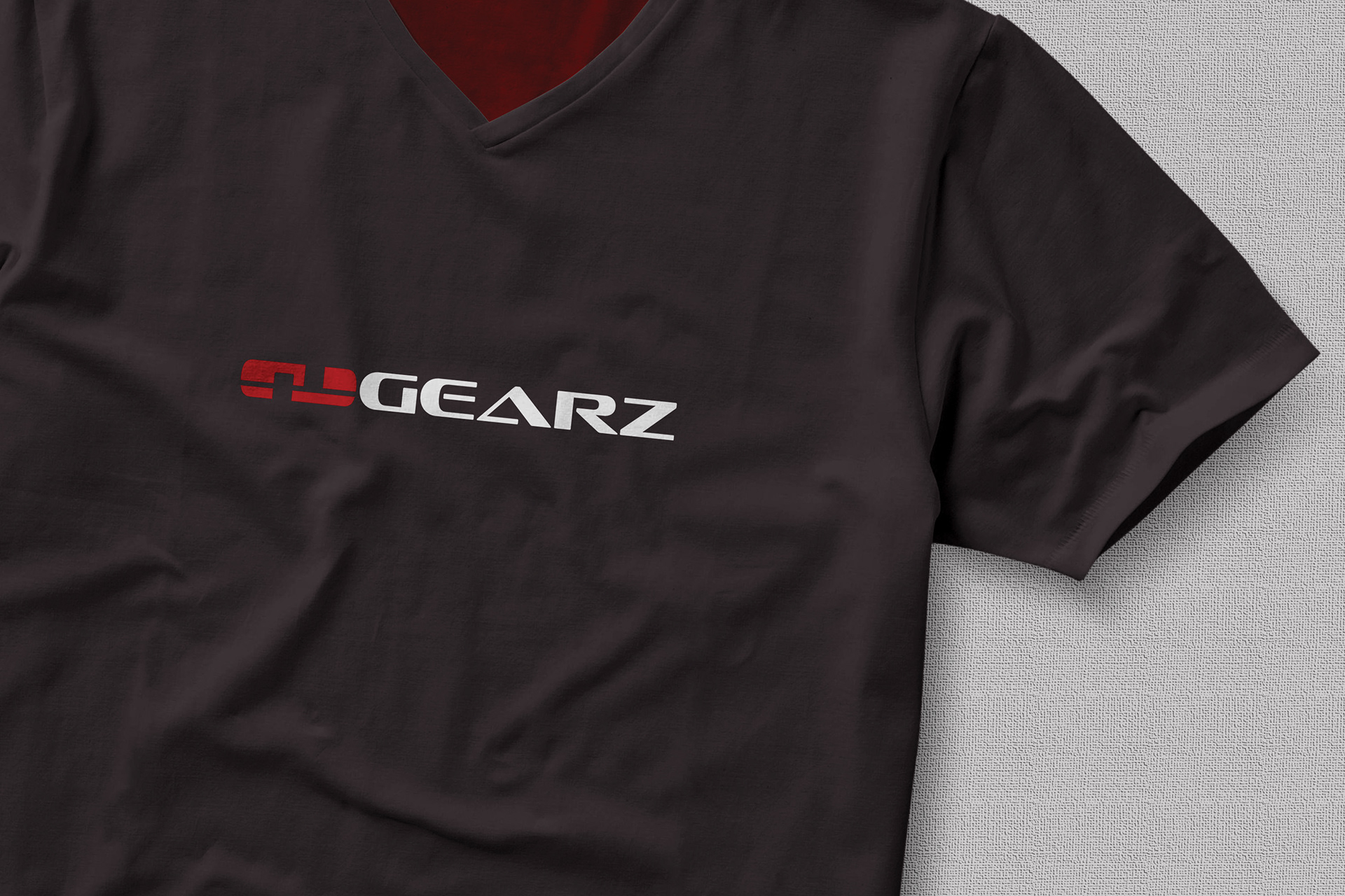
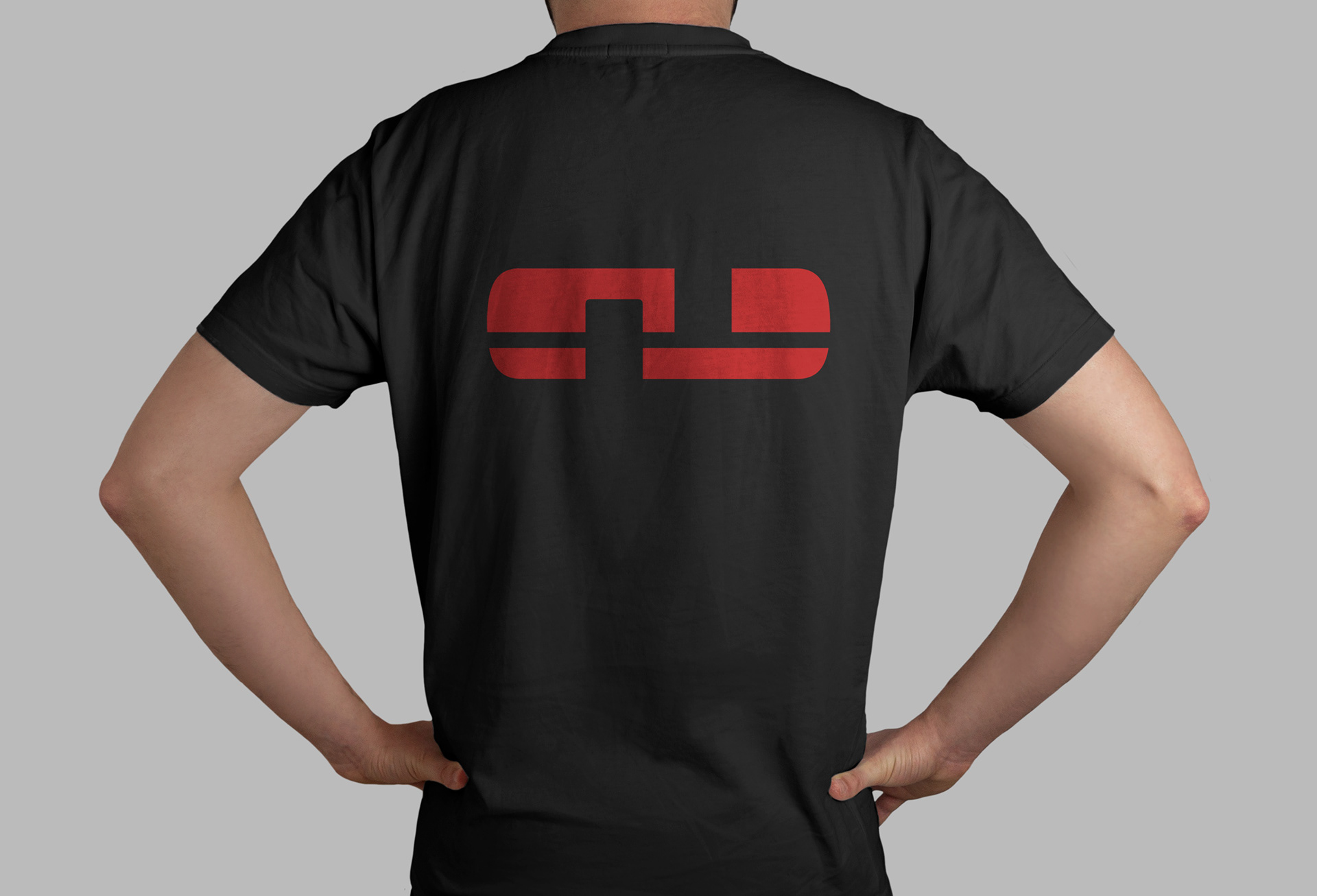
Gearz Fitness emerged from my vision to establish a brand that encapsulates empowerment, strength and resilience. Serving as a symbol of personal triumph and endurance.
The choice of minimalistic colours - black, red, and white - was intentional, making a bold and unmistakable statement. Black symbolises strength and determination, red exudes energy and passion, and white represents purity as well as balance.
Together, these colours embody the essence of Gearz, inspiring individuals to harness their inner power and push them to their limits to reach their fitness goals.
